
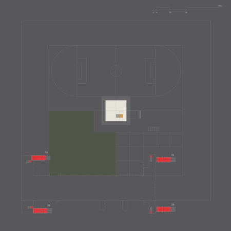
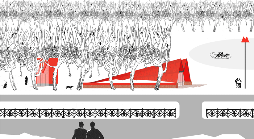
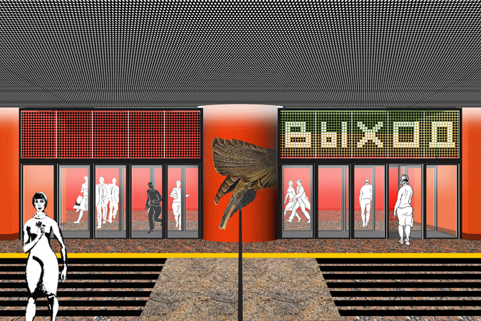
Above-ground entry pavilions: fiberglass panels over metal structure
© A+M with Aaron Goldstein & Andrew Fu with drawings from illustrated book "Moscow" by German Cheryomushkin, 1968 architecture, landscape, design copyright © 2015 All rights reserved. Material contained within this website may not be reproduced, distributed, modified, transmitted, reused or adapted without the prior written permission of Austin + Mergold LLC. |
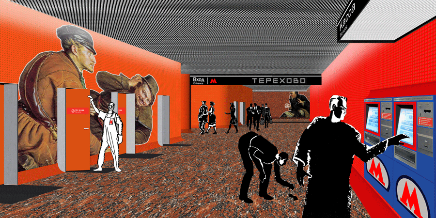
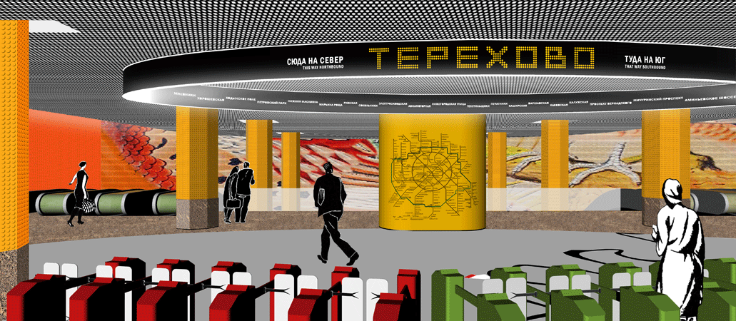
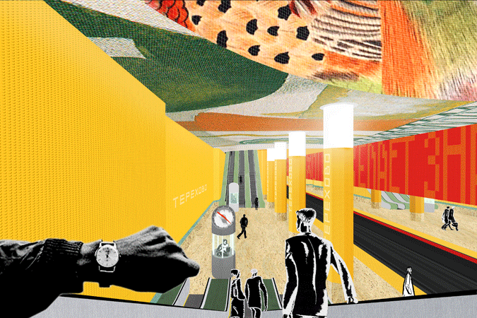
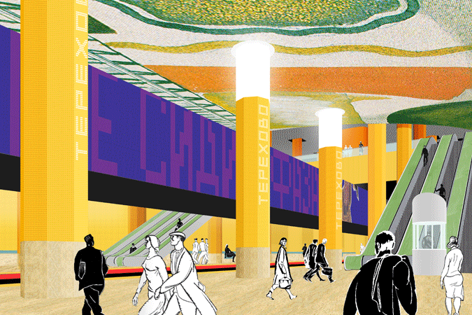
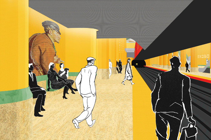
How to create a unique local contemporary yet deeply meaningful experience in this station, embracing the limited budget and strict material palette guides the design approach? The proposal is to closely examine the properties of the tactile studded resilient tile demarcating the platform edges, and its iconic color, associated with metro across the globe – the “safety” yellow, orange, red. Can color alone carry meaning? How to make the subway experience unique, yet meaningful, relatable, even educational? This material (industrial linoleum, highly washable, flame- and slip-resistant, and resilient), texture, color is already used in many metro stations worldwide, and it is usually quite utilitarian. (This material is also available in Russian Federation, and in a variety of colors.) The idea that an underground station would be a world onto itself, where bold, uncommon color combinations are acceptable isn’t new - many world’s metros have this feature (Madrid, Stockholm). In 1930’s and 1950’s metro stations in Moscow too became unique worlds – where lavish materials and extravagant artistic techniques created incredibly colorful environment. How to reference this without repeating it? |
|